UHStudyNet
Networking application to find a study friend/group for the UH Community
Developers:
Andrew Obatake Beejay Ines Kian Kobayashi Jessie GrazziotinOverview
The Problem:
Many students study alone, and thus, spend more time than necessary on school work because they don’t take advantage of study groups. The wasted time decreases their stamina and potentially their grades.
The Solution:
Create an app that facilitates the communication and selective process needed for study groups to form, so that students can create networks faster and more effectively.
UHStudyNet Vision
- Encourage collaborative learning and peer networking
- Gain traffic for the campus study hubs
- ICS space, learning emporium, library, etc
- Facilitate communication for all stages of study group interaction
- Build more effective groups by connecting students based on learning styles and preferences
Hosted Courtesy of Galaxy!
User Guide
Landing Page

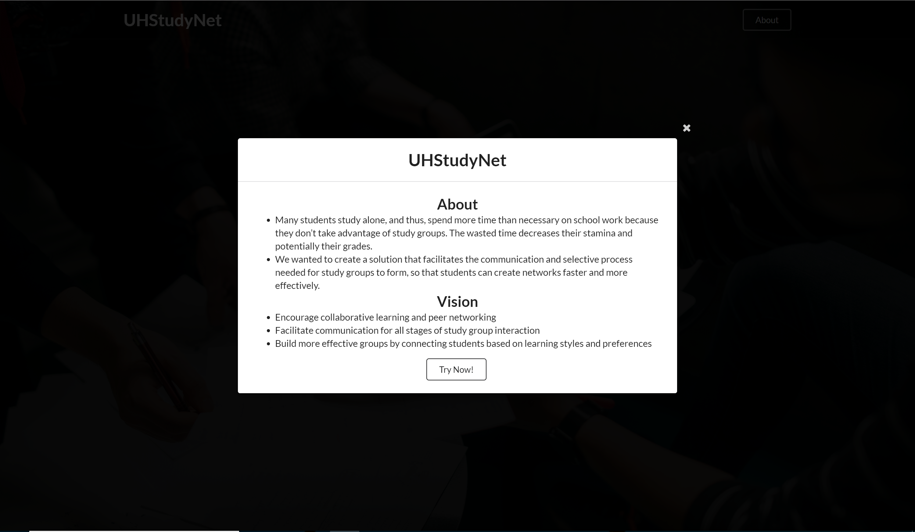
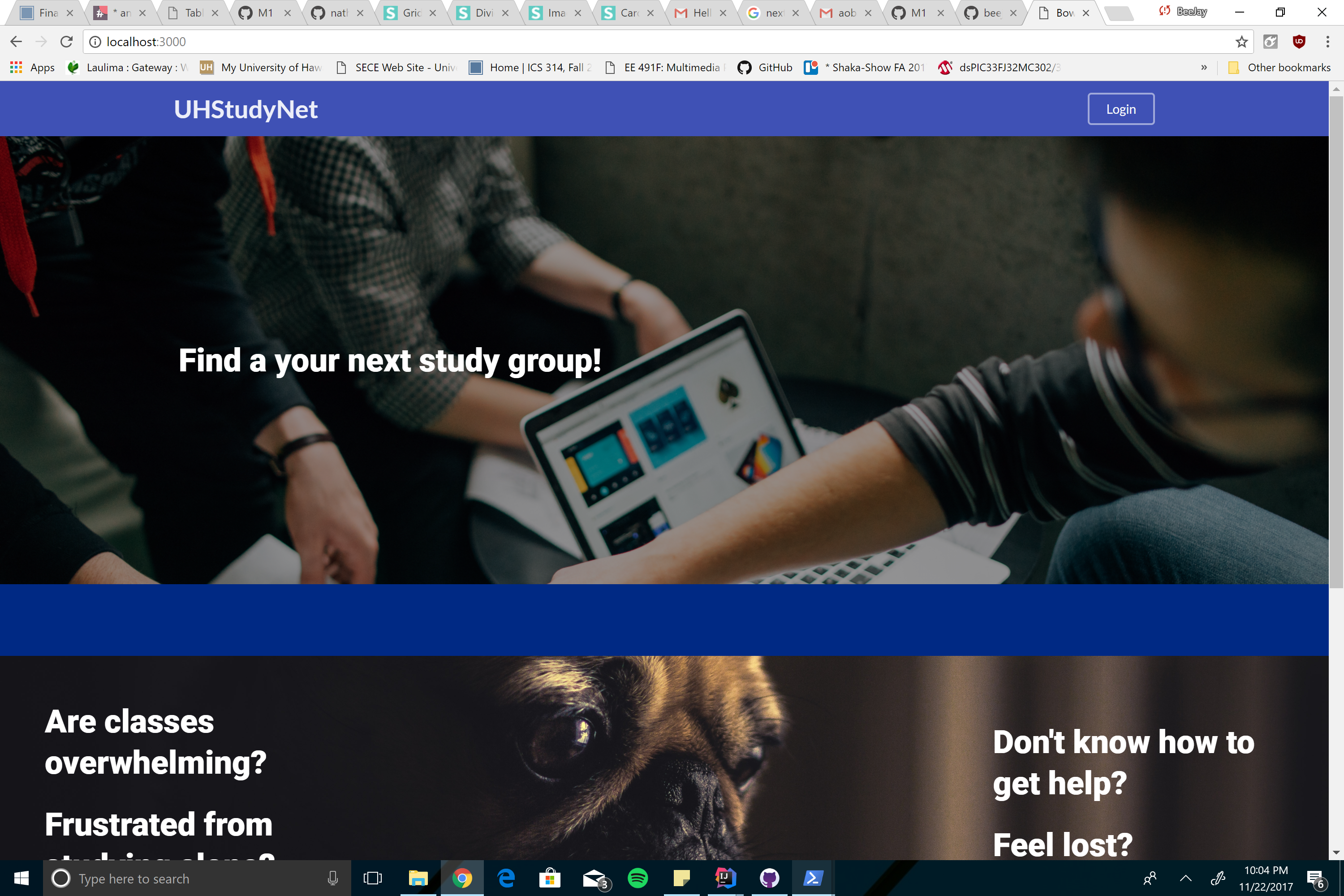
On the landing page, you can click on the login button to start using our website right away. You can learn more about our application by clicking the About button. Clicking the About button will bring you to a pop up page that explains our purpose and vision for the website. The Try Now button at the bottom can also be used to login.
My Profile Page
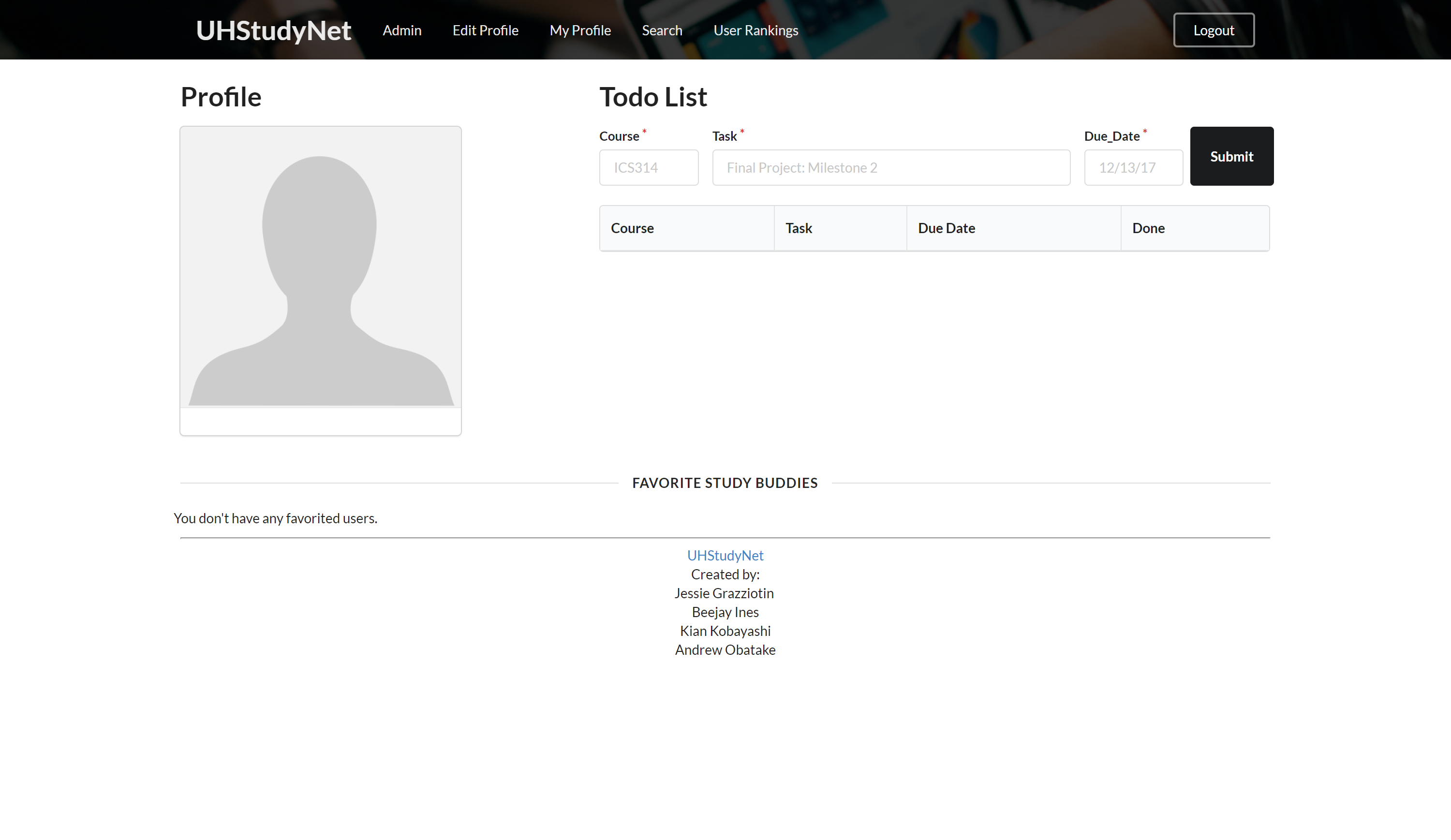
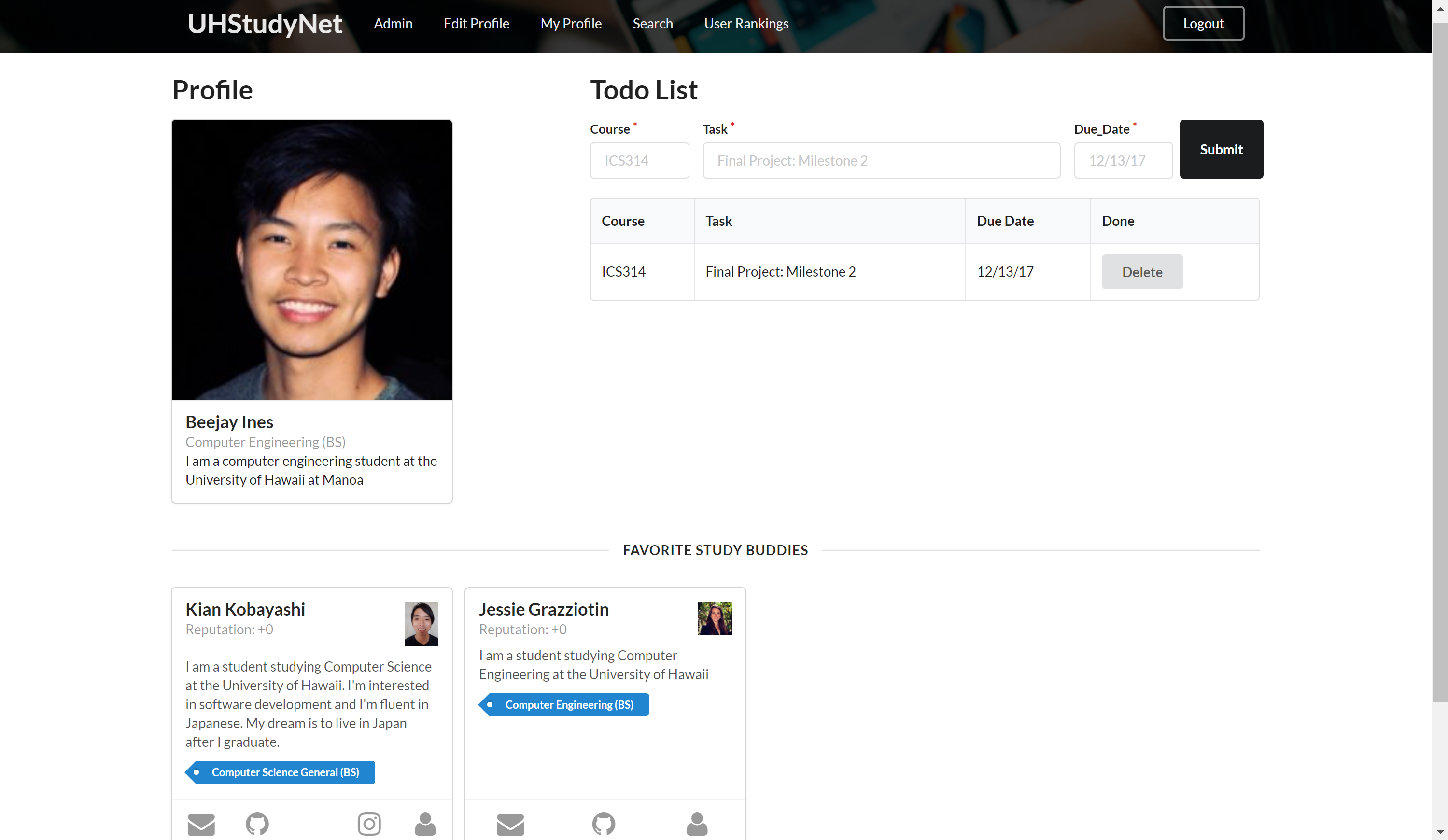
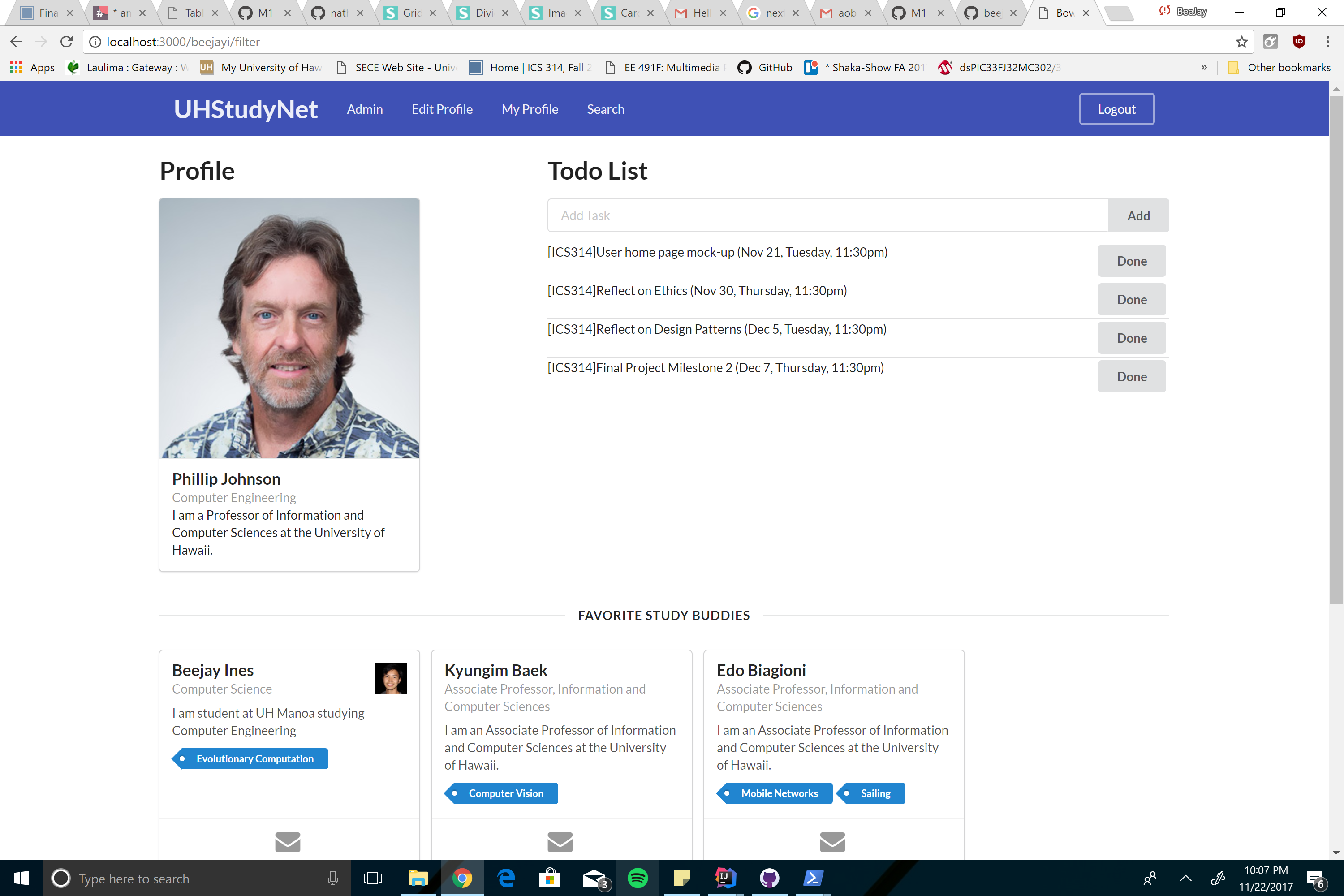
After logging in, you will be brought to the My Profile page. As a new user, your profile page will be blank, so before doing anything else, you should edit your profile and add your information. Once you have done that, you will now be able to use the functionalities of our website! On the profile page, All your information and picture will be displayed on the top left. The top right will be your to do list. Through this you can add and delete tasks that you need to do for your classes. On the bottom of the page will be your favorite study buddies. These are profiles that you have marked as a favorite and will now have easy access to them.
Edit Profile Page
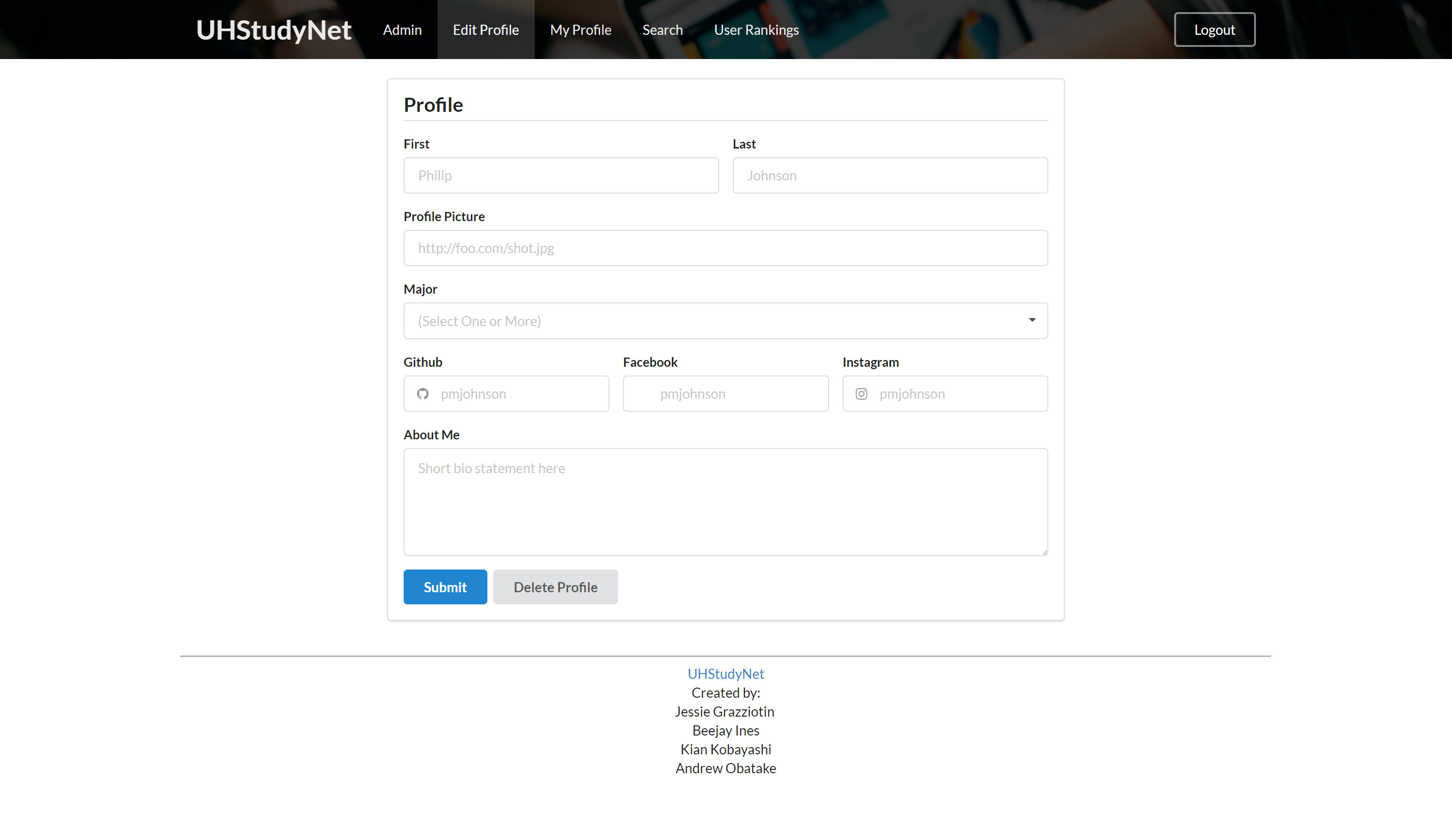
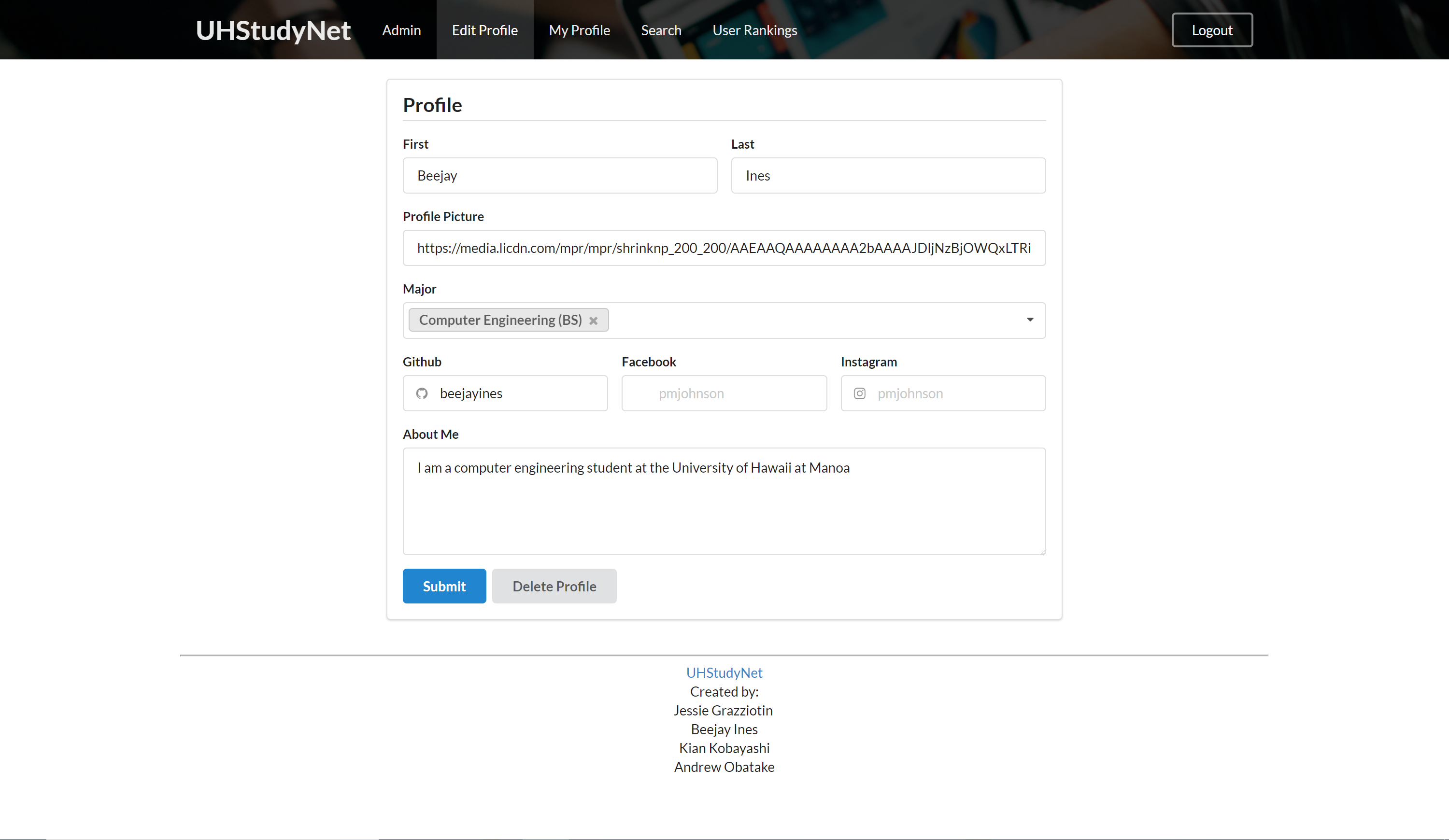
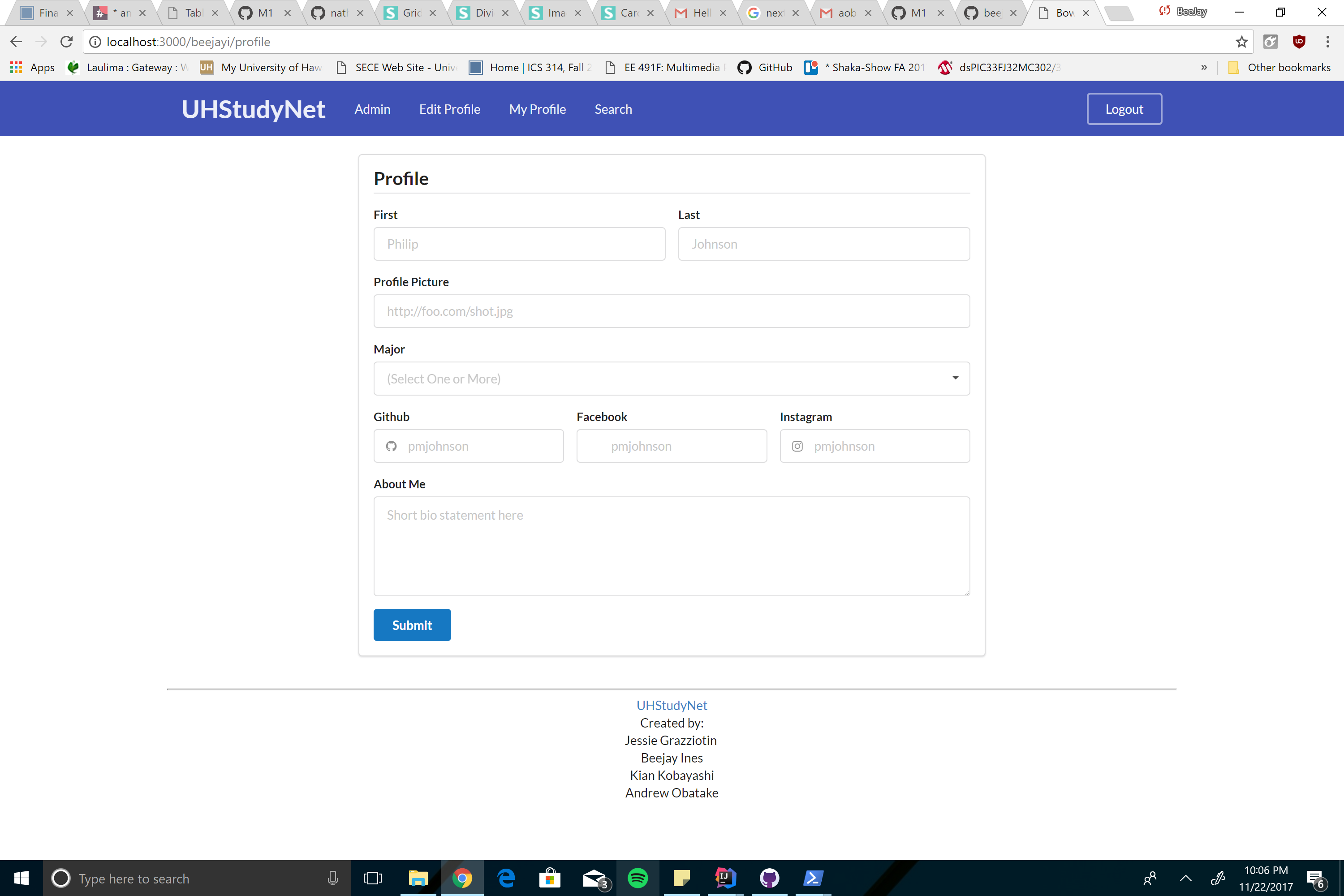
As a new user, your edit profile page will be blank and you can populate it with your information. As a current user, you are able to edit your profile any time through this page. Also you are able to delete your profile.
Profile Cards
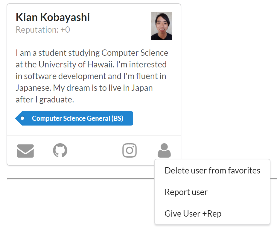
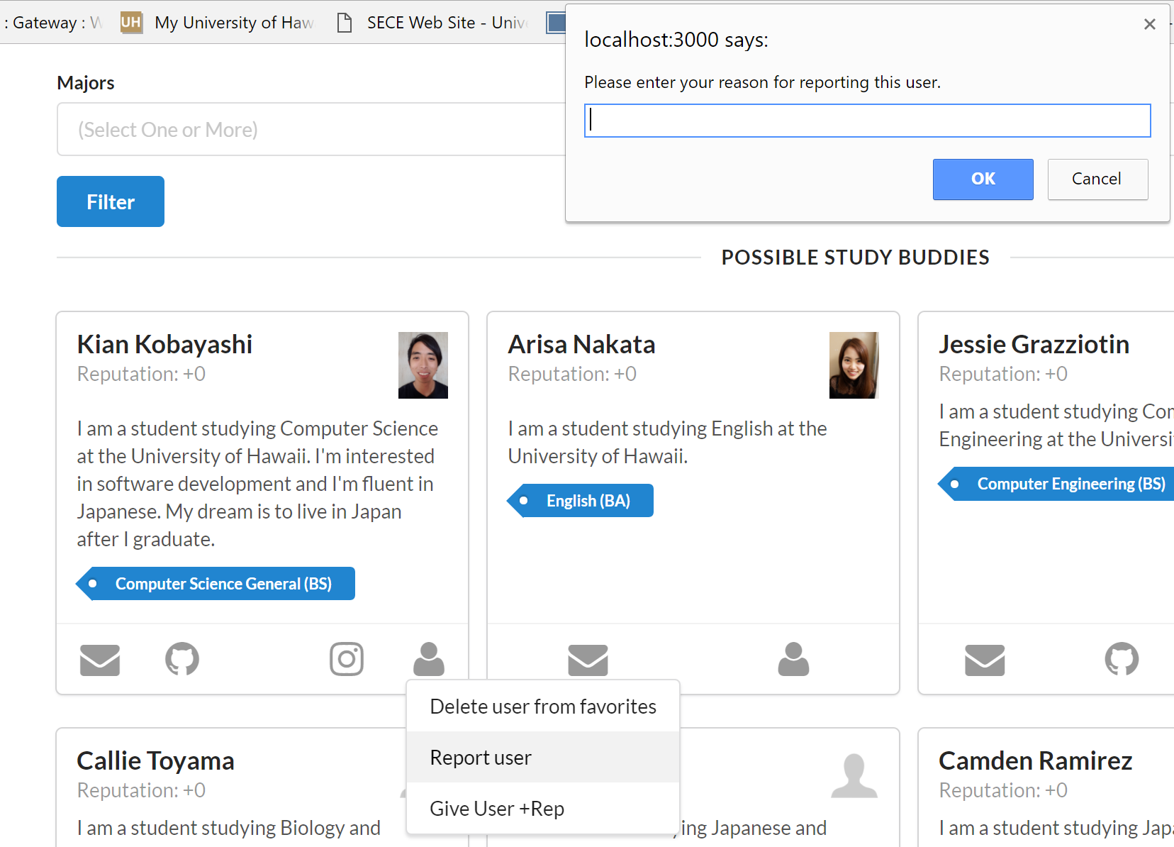
Before explaining the search and ranking page, the profile cards needs to be understood. On every profile card, there will be icons on the bottom depending on what information is available for that profile. These icons are Email, Github, Facebook, and Instagram. Every Profile will have a user icon. This icon will have 3 functionalities when clicked. The first is the option to add or remove the profile from you favorite study buddies. The second option is to report the user if you had a bad experience with that study buddy. When this is clicked, you will be presented with a text box where you must write why you are reporting the user. The last option is to add 1 to the profile’s rep if you liked studying with that student. This rep will be used in the ranking page.
Search Page

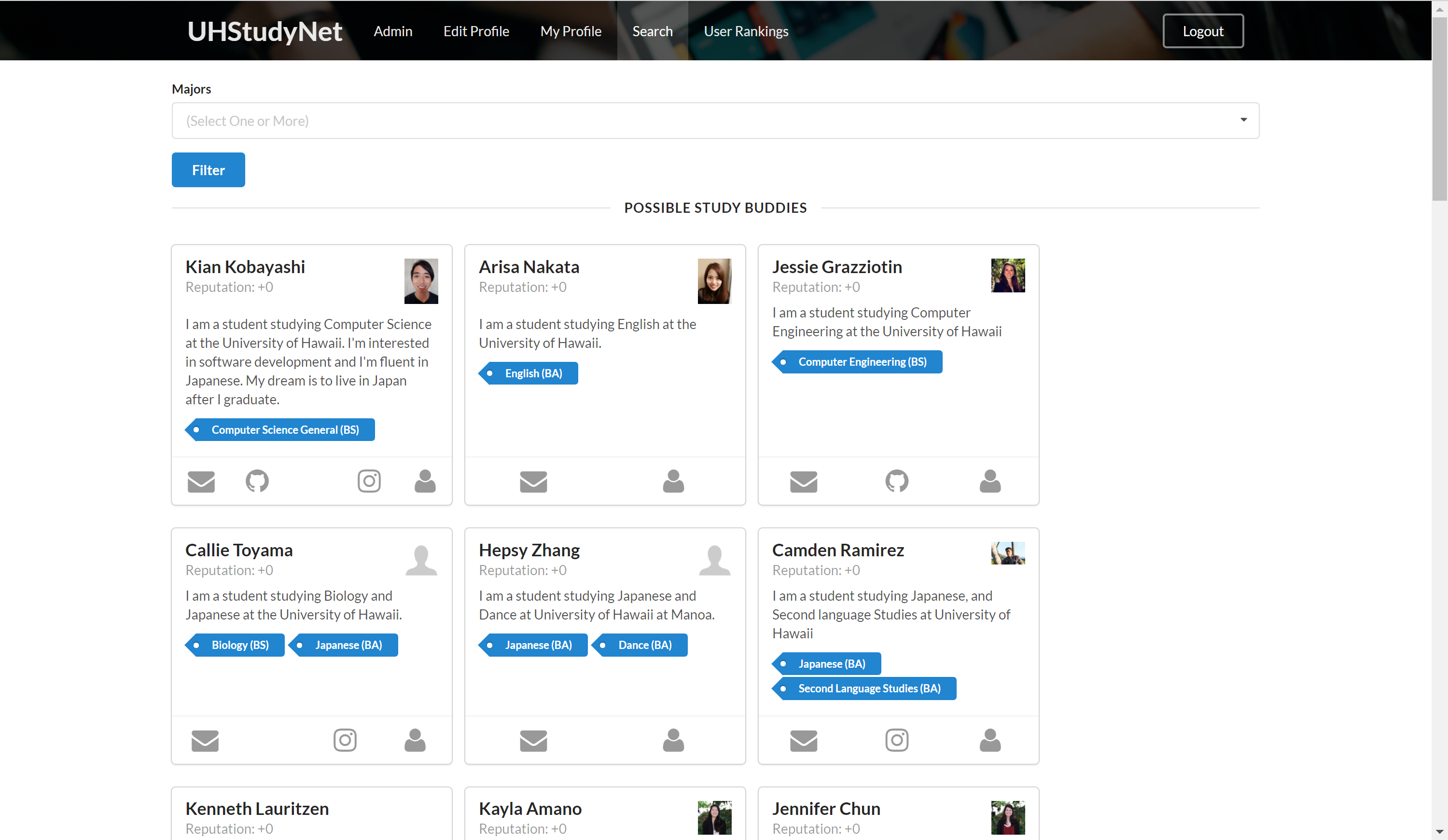
On the search page, you can find your perfect study buddy! You can browse through all the profiles, or you can filter the profiles depending on major. You can do this through the filter option at the top of the page. When you find a match, you can add them to your favorite study buddies and get in contact with them. After the study session, you can decide on whether to keep them as your favorite, report them, or give them plus 1 rep depending on the experience you had.
Ranking Page
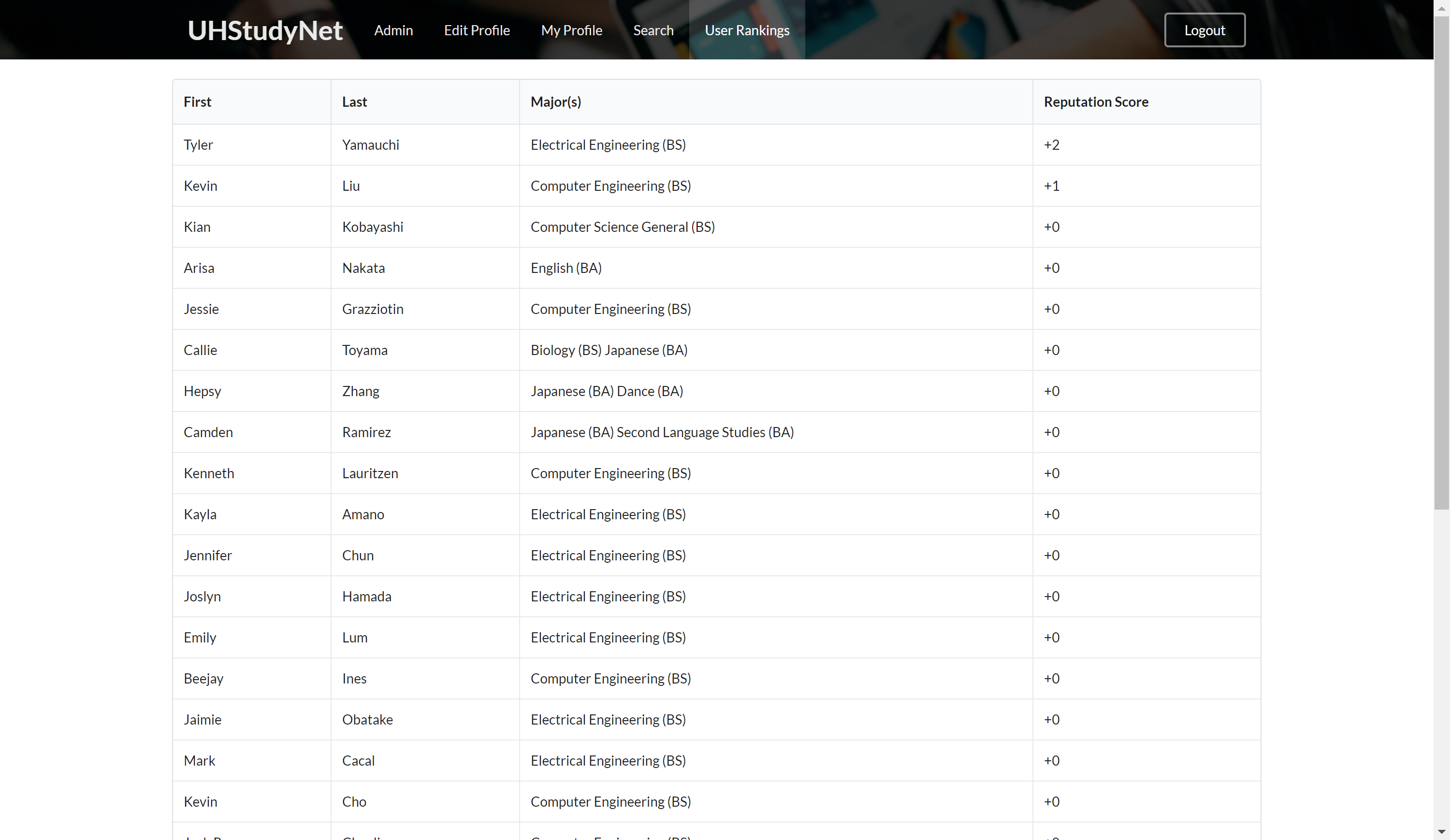
On the ranking page, you can see the ranking of all the profiles depending on their rep. You then can use this information to find your perfect study buddy!
Admin Page

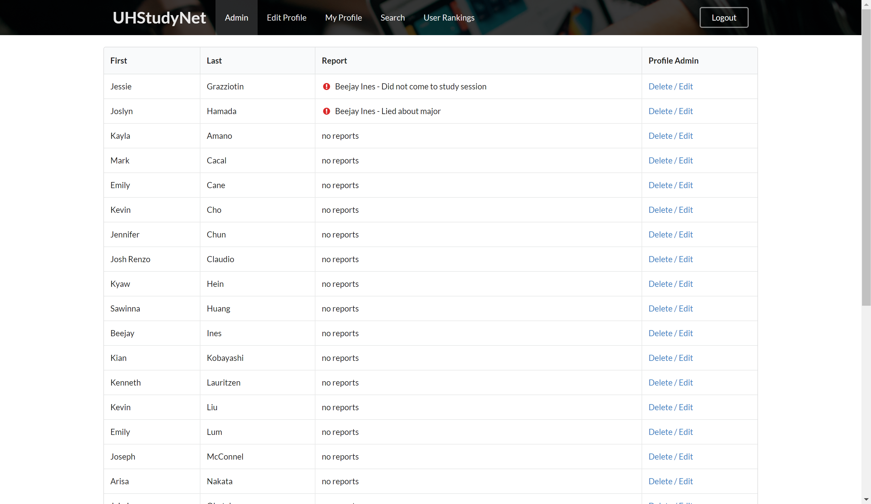
This page can only be accessed by the specified admin. A normal user will not be able to access the information on this page. As an admin, you are able to see all the reports and who reported that person. Also as an admin you are able to delete or edit any profile.
Community Feedback
We let five community members use our app and told them to provide us with any feedback. We surveyed three computer engineer majors, one japanese major, and one business major. Below is a general summary of the feedback we received. Something we observed was that students didn’t have a clear idea what the app did at first. So we added an about modal to the landing page midway through the surveys. This seemed to help people understand the purpose of our application.
Feedback
- Landing Page design, especially text, looks off.
- Images load slow sometimes
- Like the about modal on landing page
- Todos should specify courses
- Favorite study buddies is a nice feature
- Could add ranking for the users rep
Milestone 1
Separated tasks in order to get basics mockups of main pages:
- Landing Page
- Login Page
- User Home Page
- Edit Profile Page
- Admin Page
- Search Page
Landing Page
Contrasts sad and happy thoughts by using relatable images for college students
Login Page
This is exactly like the standard CAS login pop up page seen on UH websites
User Home Page
Each user has their own home page that shows their connections, preferences and a quick summary of their school TODO tasks.
Edit Profile Page
This page allows users to update their information, preferences, and image file.
Search Page
Allows users to search for other study buddies that are a match
Admin Page
Shows the full user database and eventually will allow admins to flag users under green, yellow, or red.
- Green = good standing
- Yellow = under warning from complaints to admin
- Red = about to cross the line - could be deleted soon Admins will have access to delete accounts once they pass the red flag.
Development Guide
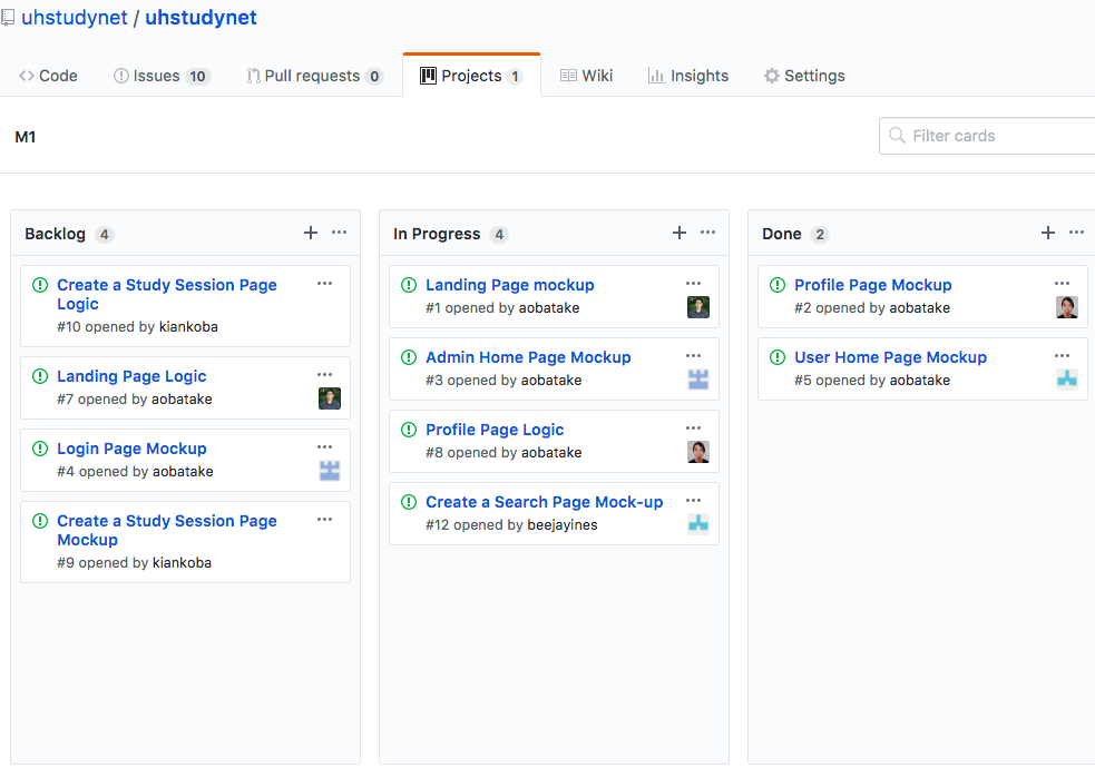
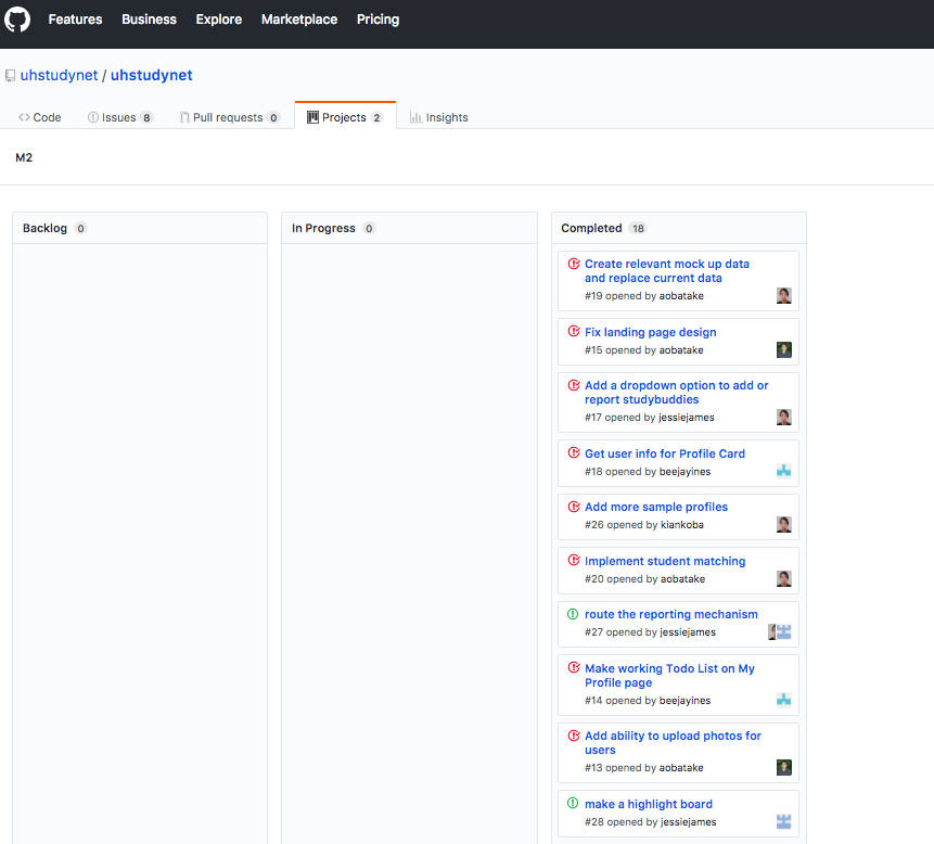
The development workflow that was used for this project revolved around the Issue Driven Project Management process. The major goals of the project were divided down into Milestones. Each milestone was further split into multiple tasks that would take an average of 2-3 development days. Each of these tasks were converted to issues using GitHub’s project management platform. To split up the work load, our team members individually strived to pick up tasks to work on for the moment as well as assign themselves tasks for after they completed their first task.
Below is a timeline of our Milestones
Milestone 1: Mockup development
The development span for this milestone was about 2 weeks. Our main goal in this milestone was to create a basic mockup of pages with the barebone HTML and style formatting needed to show the future vision of our site. In order to speed up development, the app was developed using the Meteor platform. Using this platform allowed us to practice templating. Flowrouters were used to achieve our page routing.
Here is a link to our Milestone 1 presentation: Prezi
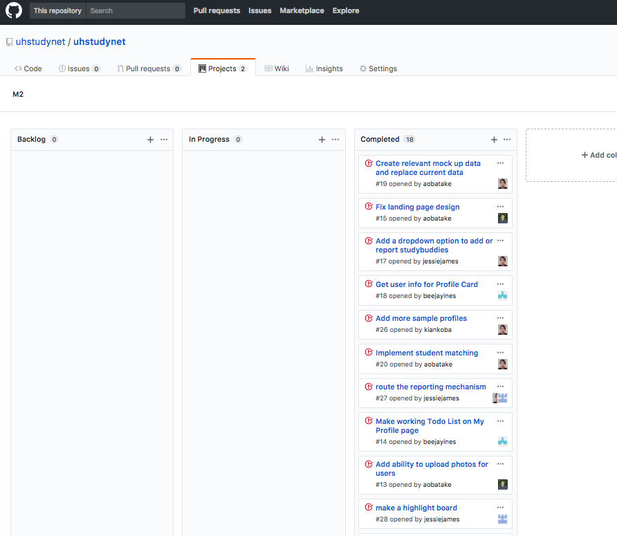
Here are a few pictures of how our GitHub project model worked:

Milestone 2: Data Aggregation and Functionality
This milestone took about 3 weeks to complete. The primary focus for this milestone was to instill basic functionality. This meant that we first needed to aggregate data and create meaninful user demos to test the functionality. The operations would revolve around a data model of Javascript classes that would hold collections of the data we intended to store.
First, a BaseCollection would create a skeleton of schema handling and get and set style functionality. This class would be the parent to our ProfileCollection and InterestCollection. The ProfileCollection would hold the data for each user while the Interest Collection would hold information regarding each major initially. In the future we plan to add more study habits to the interest collection but for basic functionality purposes, we wanted to have something uniform available for our test users.
This is an image of our Milestone 2 project page after we were finished.
